Take a look at this version 1 of our Rubric and post your comments below. One of our goals is to get some more feedback on this and then develop a cleaner, more interactive version.
02 June 2006
00:52 by Karin I too would like to see the two ends of each dimension specified if possible. It can be difficult to understand what the "setting" means otherwise.
I'm not too worried about the "rubric" aspect, as I feel this is a way for to prompt explanations of the choices each group made, without there being a "right" answer. The evaluation of the process needs to be based on clarity and thoughtfulness of the rationales given.
29 May 2006
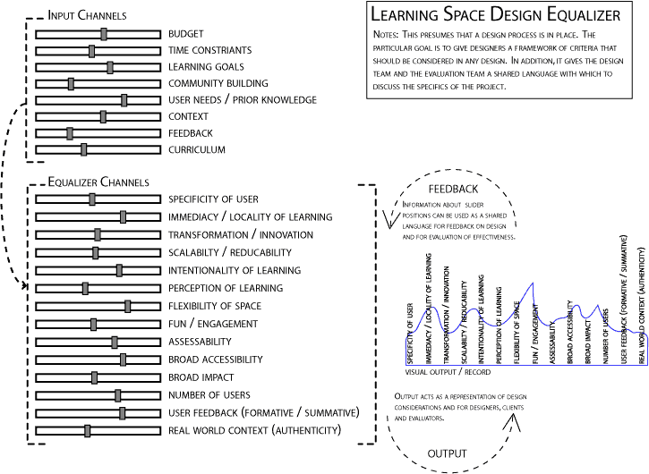
22:05 by Kristle I agree with a lot of the comments that Peggy made. I think that we have created a useful framework with which to think about the design process, but I'm unclear as to how this is a rubric. What would constitute a good or bad design? Would a good design simply take all of these characteristics into consideration? I think that the input channels is the biggest area of ambiguity. What would a slider more to the left on the curriculum (or feedback, etc) slider mean? Does a design team look at the input sliders just once and then develop the pattern for the equalizer channels? I don't want to be too negative. A lot of the positive qualities have already been stated. Overall, I think we did a good job of bringing a lot of different paradigms together.
12:16 by Co I like this a lot. I think it has a lot of potential. a couple of things that would make it more useful would be 1) to make it crealy which side (Left/right) represented which end of the spectrum for each of the characteristics. 2) since this is an evaluation tool It would be nice to spell how how it will be used to evaluate projects
11:52 by Hal In working with the rubric I notice that there are basically two different kinds of slider use for the Equilizers (not so much for the input although there are a couple ways of thinking about those too).
The first is using the slider to measure how 'well' a space performs in a category such as fun / engagement or assessability.
The second is pinpointing where where a space is along a spectrum, such as user feedback summative to formative and number of users designed for where there is not one 'optimal' point in the spectrum.
I believe both applications are important but having two basic modes of use in a single category of the rubric seems to be complicated and confusing.
In terms of the equilizer metaphor, the use of the sliders to represent spectra where design decisions are placed rather than ways of evaluating how well a design does a certain thing makes more sense.
In this metaphor sliders are things over which you have some degree of direct control. Input sliders measure how much attention your design pays to input factors such as user feedback, learning goals, etc. Equilizer sliders represent how your design fits into a certain place of a spectrum.
Aspects such as engagement, flexibility, come more as results of the positioning of the sliders, come out of the design, rather than being direct decisions themselves.
Perhaps these can be the output channels of the equilizer -- the different tracks of a song or the different speakers of a stereo? Or they could be the users listening to the music. One might be engagement, etc etc. Something that represents, in this idiom, a thing that is NOT under the direct control of those running the equilizer but is, rather, a result of the process.
26 May 2006
18:56 by Agnes Chan The more I think about it, the more I like it. The model really covers the issues that our group struggled with in terms of figuring out a way to focus on the learning theory and education portion of what is important in designing learning spaces. Also, being able to really tailor the model to each of our own projects is really important since the different spaces are so unique (from a small preschool classroom to a new city in Korea!) But the model assumes that we all came into the course with a foundation in basic design principles, and it seems to lack some of the basics that I have personally never been assessed on. Although understandable that the majority of the class has a solid foundation in design practices and "routines," I definitely do not! There would be nothing I would necessarily change about this model, but in terms of assessing a newbie designer (such as myself), I feel like another layer in basic design could be added. Otherwise, I love the specific and unique way this model hones in on learning spaces as opposed to other objects and spaces.
Also - great job on making this model so pretty!
24 May 2006
16:18 by Peggy Chung What a great model! I think you all captured a lot of the topics that need to be considered in designing a learning space. Some questions I have in using the equalizer are: How do we determine a successful learning space design? If we have high's in some of the categories, and lows in others, does that mean it's still a good design? We can't always try to get highs in all categories based on the constraints of the space, so are we just trying to emphasize the fact that learning spaces are not static and open to change depending on changing needs/inputs? What are the parameters that define when a learning space is high or low on the equalizer (I'm also assuming the channels/gray boxes can move anywhere on the bar with low on left and high on the right). For instance, how do you define broad accessibility? Would a high include the entire range of audiences possible from infant to elderly? Are we thinking broad accessibility in terms of how it appeals to multiple audiences? I can't think of one at present, but let's say in a situation where your learning space is constrained by one specific type of user such as the young adult audience, if you're able to appeal to all the different needs within that category, does that mean it's also a high?
10:45 by Deb Kim The more I take time to sit with this tool, I am inspired to try it out, add to it, critique it, share it, and have more conversations around it. The one thing I would love for some students to do in their comments, is to add the nuances of it's design rationale, the process of the development of it's design, and relevants, affordances, contraints - the things that came up in conversation that are not capture in this static representation. Look forward to seeing your comments before May 22.
23 May 2006
17:37 by Dan Gilbert This is a great start on this project. I will look at it in depth in the next few days, in the meantime, I invite you to add all of the things you wish you could have said in class on May 22.
Many Thanks to Jeremy Sabol at CTL for making this comment box easy to use.
Click on the link below to watch a little quick time movie that documents our process