Before analyzing Morningstar's Category Ratings it is useful to define two broad general categories of risk-adjusted performance measures.
Scale-independent measures are unaffected by the scale at which an investment strategy is undertaken. They measure the performance of zero-investment strategies that can be undertaken at any desired level of risk and return. They require few assumptions about investor preferences other than that return is good (more is preferred to less) and that risk is bad (less is preferred to more). Generally, such measures are formed by dividing a return measure by a risk measure. All variations of the Sharpe ratio are included in this category.
Utility-based measures are designed to indicate the desirability of a particular investment strategy for an investor with a specific attitude toward risk vis-a-vis return. Even if the strategy in question can be taken at alternative scales, the measure applies to a specific scale. Such measures generally are formed by subtracting from a measure of return the product of a measure of risk times a measure of the investor's risk aversion (or the result obtained by dividing the measure of risk by a measure of the investor's risk tolerance). Such measures assume not only that return is good and risk is bad, but also that the investor's willingness to accept more risk in pursuit of more return can be quantified and is equal to the particular value of risk aversion or risk tolerance utilized in the computation. A utility-based measure is typically used for a strategy that involves the outlay of funds, as opposed to a zero-investment strategy.
As we will show, Morningstar's risk-adjusted ratings have the form of a utility-based performance measure but are adjusted so that in many cases they are closely aligned with scale-independent measures.
To compute its category risk-adjusted rating, Morningstar subtracts a fund's category risk measure from its category return measure:
msCRARi = msCReti - msCRiski
Each of the components is, in turn, computed by dividing the appropriate measure for the fund by a base value that is the same for all the funds in the category:
msCReti = EVRi / RetBasec(i)
msCRiski = AMLi / RiskBasec(i)
Substituting these equations in the formula for the category risk-adjusted rating gives:
msCRARi = EVRi / RetBasec(i) - AMLi / RiskBasec(i)
Rewriting:
msCRARi = (1 / RetBasec(i) ) [ EVRi - ( RetBasec(i) / RiskBasec(i) ) AMLi ]
Given the procedures used to determine the return base, the term outside the square brackets will always be a positive constant greater than zero and will be the same for all the funds within a given category. Thus both the rankings and relative values of the category risk-adjusted rating will be the same as if only the term in the square brackets were utilized. This can be written as:
EVRi - rac(i) AMLi
where:
rac(i) = RetBasec(i) / RiskBasec(i)
This shows that in form, at least, Morningstar's category risk-adjusted rating is a utility-based performance measure, with the ratio of a category's return base to its risk base serving as a measure of investor risk aversion. However, two aspects are unusual for such a measure. First, the components are based on zero-investment strategies, so the measure can be made larger or smaller by changes in the scale. Second, the risk-aversion parameter is determined by the historic performance of the funds in the category to which the fund in question has been assigned. As will be shown, the second attribute gives the category risk-adjusted rating some of the characteristics of a scale-independent measure.
It is difficult to characterize the category risk-adjusted rating as a measure of expected utility derived from a more fundamental function relating an investor's utility to fund return. It uses a return measure based on the annualized difference between the three-year compounded return on the fund and that obtained from Treasury bills in conjunction with a risk measure based on an arithmetic average of monthly losses, hence combining in one measure statistics appropriate for investors with two different horizons. A more consistent approach would utilize a fund's average monthly excess return for the first component, making it consistent with the second component. The combined measure would then be appropriate for an investor with a horizon of one month or for an investor who believed that the resulting statistics could be used to project results for longer horizons based on a maintained hypothesis of zero serial correlation of monthly values.
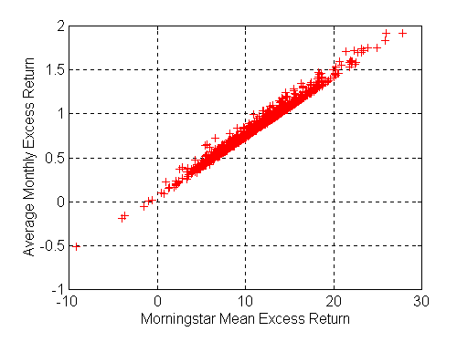
In practice, average monthly excess returns are closely related to the return measures used by Morningstar. The figure below shows a cross-plot of the two for the funds in our 3-year sample. Since Morningstar's measure is annualized, while the average monthly excess return is not, the scales differ but the correlation (0.993) is very high.
Morningstar Mean Excess Return versus Average Monthly Excess Return
The similarity of the two return measures allows us to interpret Morningstar's category risk-adjusted rating as an approximation to a function of the following form:
EUi = AMERi - k * AMLi
where
AMERi = fund i's average monthly excess return
AMLi = fund i's average monthly loss
EUi = the expected utility of fund i's performance
We are now ready to answer a key question. If this formula gives the expected utility for a fund, what is the underlying utility function whose expected value is being measured?
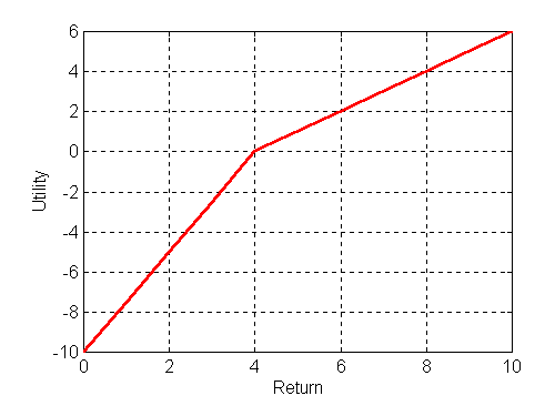
The answer is that the function in question is composed of two linear segments, with a kink at the point representing the return on bills. We will call this a bi-linear utility function. First, we show its consistency with the performance measure, then consider its relevance for investment decision-making.
Consider a utility function of the form:
U =
( Ri - B ) if Ri >= B
kk * ( Ri - B ) if Ri < B
where B is the return on a Treasury bill and kk is a constant. As can be seen below for an example in which kk =2.5 and B=4, such a utility function plots as two straight lines and hence can be termed bi-linear.
A bilinear utility function with kk = 2.5 and a bill return of 4%
Now consider the following utility function
U =
( Ri - B ) +
( kk - 1) * ( Ri - B ) if Ri < B
If Ri exceeds B, this will give the same utility as the previous function; this will also be the case if Ri is less than B. Hence this is the same bi-linear utility function.
Now consider a set of t possible Ri values. Let pt be the probability that Ri will equal Rit. Then the expected utility will be:
EUi =
sumt { pt * ( Rit - B) } +
( kk -1 ) * sumt { pt * ( Rit - B) } for Rit < B
When historic data are utilized, frequencies replace probabilities ( with1/t substituted for each pt ), but the procedure is the same. In this case the first sum will equal the average monthly excess return while the second sum will equal the average monthly loss. Thus:
EUi = AMERi + ( kk -1 ) * AMLi
or:
EUi = AMERi + k * AMLi
where:
k = kk -1
Note that the second expression is the approximation for the category risk-adjusted rating. Hence we conclude that the latter is appropriate for an investor with a bilinear utility function that has its "kink point" at the level of the return on Treasury bills.
A key attribute of a bi-linear utility function is its "kink" at a "reference point". Outcomes that are superior to the reference points are considered gains while those that are inferior to the reference point are considered losses. The change in slope at the reference point reflects the assumption that the investor considers the disutility associated with a small loss to be greater than the utility associated with a small gain of equal absolute magnitude. This attitude, found in countless experiments in cognitive psychology, was termed loss-aversion by Kahneman and Tversy1. It is a central part of their prospect theory, designed to model the behavior of individuals when making decisions under uncertainty. In the bilinear version, parameter k measures the degree of the investor's loss aversion -- the greater the value of k, the greater the disutility of a loss relative to the utility of a gain. While experiments show that individuals differ significantly in their degree of loss aversion, values from 2.0 to 2.5 are relatively typical.
While the bilinear utility function captures one aspect of investor behavior, it leaves out other aspects included in the models of prospect theory. Kahneman and Tversky found that many investors exhibit risk aversion in gains and risk preference in losses, giving utility functions considerably more complex than the bi-linear version. Moreover, prospect theory takes into account that, when evaluating uncertain prospects, individuals assign weights to possible outcomes that differ in predictable ways from objective estimates of probabilities. None of these added complexities is reflected in our simple utility function and hence none is taken into account in an explicit manner in the Morningstar risk-adjusted ratings.
While the bi-linear utility function captures important aspects of individual behavior, the use of a one-month horizon (at least for losses) and the return on bills as a reference point may be subject to debate. Concerning the latter, the question is whether an investor regards, say, 0.1%. as a loss when she could have earned 0.4% from a Treasury bill. At least some experimental evidence would indicate that investors consider any absolute return to be a gain. Measures that associate significant disutility with opportunity losses rather than with only actual losses may thus fail to fully conform to investors' notions of risk.
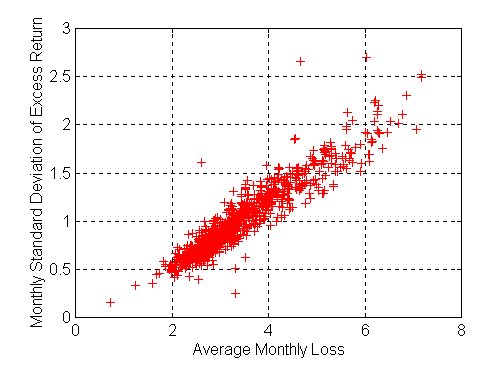
Given the ubiquity of loss-aversion, Morningstar's emphasis on average loss can be understood as an attempt to appeal to investors' basic notions of risk. Indeed, much is made of the difference between this intuitive measure of risk and standard deviation, the somewhat less easily accessible measure used by academics and some other industry practitcioners.
As a practical matter, however, there appears to be little difference between the two measures when used in conjunction with measures of expected or average return. Consider the relationship between the average monthly loss and the monthly standard deviation of excess returns. Each point in the figure below plots one of the funds in our 3-year sample. As can be seen, there is a close relationship between the two measures -- the correlation coefficient is 0.932.
Average Monthly Loss versus Monthly Standard Deviation of Excess Returns
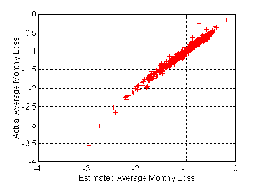
Even this understates the similarity of the "downside risk" and "mean-variance" approaches. The ultimate question is whether decisions made on the basis of expected return and downside risk are likely to differ significantly from those made on the basis of expected return and standard deviation. This can better be addressed by examining the extent to which a fund's average monthly loss can be estimated, given its average excess return and standard deviation of excess return. A multiple regression analysis shows that the correlation is extremely high. Both independent variables (average monthly excess return and standard deviation of monthly excess returns) are highly significant, with an overall R-squared value of 0.9797. The figure below plots the actual and estimated average monthly losses -- not surprisingly, they differ little due to the high correlation, which is in excess of 0.99 (the square root of 0.9797) .
Average Monthly Losses: Actual versus Estimates based on
Average Excess Return and Standard Deviation of Excess Return
Given the dangers associated with assuming future return distributions will be precisely like those of the past, it appears that the set of funds regarded as efficient on the basis of mean and average loss will be very similar to that regarded as efficient on the basis of mean and standard deviation of excess returns. In the present context, any significant differences between Morningstar's approach and those associated with mean-variance analyses will almost certainly be attributable to other factors than the differences in measures of risk.
We have argued that, in form at least, the Morningstar risk-adjusted ratings are utility-based performance measures. If they were intended to serve as such one would expect that the loss-aversion parameter would be given a value considered representative of a class of investors and that the same value would be used consistently through time. This is, in fact, not the case. Instead, the parameter is determined by the performance of the funds in the peer group being evaluated. Thus it differs across categories for the category ratings and across major asset classes for the star ratings. Moreover, the parameter may differ from period to period for a given category or asset class. It is thus difficult to give a risk-adjusted rating a meaningful interpretation as a utility-based measure, given the seemingly arbitrary and inconsistent manner in which the key parameter is determined in each instance. Some other explanation is clearly needed.
In fact, there is scant evidence in Morningstar's literature that the ratings are even considered utility-based measures.One might speculate that they simply evolved through time. Possibly Morningstar started with the traditional 3-year cumulative return measure. Then a Treasury bill 3-year return was subtracted to better measure the added (or subtracted) performance due to risk-taking. Next, a plausible and intuitively appealing measure of risk (average monthly loss) was computed to take risk into account. To combined both measures, normalization was employed -- first within each asset class for the star ratings and later within each category for the category ratings. At some point is was probably realized that the use of average values for the return denominator could pose a problem so a somewhat arbitrary rule was devised to provide a lower bound equal to the 3-year return on Treasury bills. While each of the aspects of the computation seems reasonable, when viewed as a whole, the procedure seems to lack a consistent basis.
But it is important to look beyond the formal rules for the calculation of the Morningstar measures to their effects. Due to the somewhat ad hoc change in the procedure when an asset class or category falls provides less than twice the return on Treasury bills, we must approach this question in two stages. To simplify the exposition we define a good time for a category or asset class is one in which the average excess value relative for the funds in the category or asset class is at least twice as great as the growth in value obtained from Treasury bills. Conversely, a bad time for a category or asset class is one in which the average excess value relative for the funds in the category or asset class is less than two times the growth in value obtained from Treasury bills. The distinction is critical, since the method used to calculate the denominator for the return rating and hence the implied loss-aversion in the utility function differs in the two cases. We turn first the the results obtained in god times.
If the last 3 years has been a good time for the funds in a category, the utility function used by Morningstar will be:
EVRi - rac(i) AMLi
where:
rac(i) = RetBasec(i) / RiskBasec(i)
and:
RetBasec(i) = avgj in c { EVRj }
RiskBasec(i) = avgj in c { AMLj }
For purposes of our analysis, we use the similar (but more consistent) version in which average monthly excess return serves as the measure of return. The corresponding measures would be:
EUi = AMERi + k * AMLi
where:
k = avg{AMER} / avg{AML}
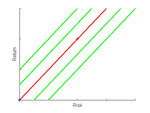
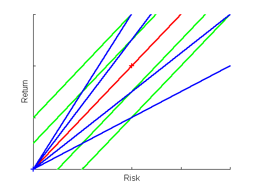
Consider now a fund for which AMERi = avg{AMER} and AMLi= avg{AML}. We will call this an average fund and denote it with the subscript a. Note that for such a fund the expected utility (EUa) is zero, as is the expected utility of a Treasury bill (for which both AMER and AML are zero). In the figure below, the horizontal axis plots risk (here, AML) and the vertical axis expected or average return (here, AMER). The average fund is represented by the red plus sign, and Treasury bills by the blue plus sign at the origin. All funds that plot on the red line running through these two points have the same expected utility (zero). This is an indifference (iso-expected utility) curve for the utility function in question -- that is, a curve showing a set of risk-return combinations among which the investor is assumed to be indifferent. Note that in this construction the curve is a straight line with a slope equal to the loss aversion parameter (k) and an intercept equal to the associated expected utility (here, zero). The diagram also shows additional indifference curves -- each corresponding to a selected levels of expected utility. Points on higher curves provide more expected utility (are given higher ratings), while those on lower curves provide less expected utility (are given lower ratings).
Iso-utility Indifference Curves
Now consider a scale-independent measure of performance. First, note that both AMER and Morningstar's return measure relate to the return of a zero-investment strategy in which a long position is taken in the fund in question and a short position in Treasury bills. If these positions were doubled in size, the returns relative to the investor's notional position would also be doubled. But this is also true both our measures of risk -- AML and the standard deviation of monthly excess returns. Thus by doubling positions, utility could be doubled. Note, however, that whatever the scale, the ratio of either return measure to either risk measure would be the same. Thus such a ratio will be scale-independent. In this example, we use the AMER/AML ratio as a scale-independent performance measure.
Given these relationships it is clear that any point on the red line in the figure above can be obtained with an appropriate combination of the average fund and Treasury bills. More generally, any point on a ray from the origin can be obtained by combining a fund that plots on that ray with Treasury bills. The arguments given in the section on the Sharpe ratio thus apply directly, and funds with greater AMER/AML ratios would be preferred to those with smaller ratios by any investor able to lever holdings up or down to obtain a desired level of risk.
The figure below shows a number of other lines showing sets of funds with equal AMER/AML ratios (or, more generally, return/risk ratios for a zero-investment strategy).
Iso-utility Indifference Curves and Iso-Return/Risk Curves in Good Times
We note in passing some troublesome implications of the simple bi-linear utility function. Consider an investor faced with one or more funds plotting on the red line. He or she would be indifferent among all combinations of risk and return that could be obtained by levering one or more such funds up or down. An investor faced with one or more funds plotting on one of the blue lines plotting below the red line would choose to put all of his or her funds in Treasury bills. On the other hand, an investor faced with funds plotting on one of the blue lines plotting above the red line would choose to lever up to obtain the maximum allowable risk and return. If investors really had utility functions of this type we would observe primarily extreme risk-return strategies -- a result inconsistent with observed behavior in which most investors choose combinations of cash, bonds and stocks. This calls into serious question the underlying assumptions needed to formally derive some of the simplistic performance measures incorporating downside risk.
This diversion completed, we now turn to a comparison of fund rankings based on the two performance measures (Morningstar's and one using the ratio of return to risk). First, note that the two measures give the same results along the red line. Moreover, note that any fund with a greater AMER/AML ratio than that of the average fund (k) will be considered superior to the average fund no matter which measure is used. Conversely, any fund with a smaller AMER/AML ratio than that of the average fund (k) will be considered inferior to the average fund, no matter which measure is used. Whether intentionally or not, by selecting a loss aversion parameter equal to the AMER/AML ratio for the average fund Morningstar assures equality of implications in at least this respect.
When comparing two funds plotting above the red line, the two measures may, of course, give contradictory results. This may also be the case when comparing two funds plotting below the red line. But as long as funds plot relatively near the point representing the characteristics of the average fund rankings may be reasonably similar, as can be seen from the figure.
By construction, then, in good times the procedures used by Morningstar could well result in fund rankings that are similar to those that would be obtained with a scale-independent performance measure. This is evidenced by the results for the 1994-1996 period, which was a "good time" for every one of the diversified equity categories. Each point in the figure below plots (1) the rank of a fund within its category based on its Morningstar category risk-adjusted rating (msCRARi) on the horizontal axis and (2) its rank based its monthly excess return Sharpe ratio (MERSRi) on the vertical axis. As can be seen, the ranks differ relatively little( the correlation coefficient is 0.986).
Utility-based and Scale-independent Rankings within Categories
The similarity of results is striking, especially considering the differences in the methods used in the calculations, summarized in the table below.
| Morningstar Risk-adjusted Rating | Sharpe Ratio | |
| Return | Annualized difference in Value Relatives of Fund and Bills | Average Monthly Excess Return |
| Risk | Average Monthly loss (negative excess return) | Standard Deviation of Monthly Excess Returns |
| Performance | Return - k*Risk | Return/Risk |
It seems warranted to conclude that whatever its intuitive advantages or logical failings, in good times Morningstar's risk-adjusted rating system may well give results similar to those that could be obtained using the simpler and more traditional excess return Sharpe Ratio. In such situations, Morningstar's measure may in fact be a scale-independent ratio in utility-based clothing.
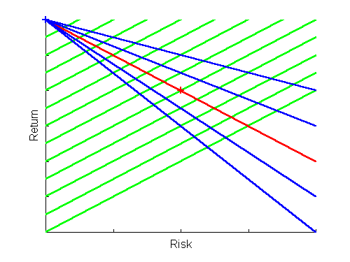
In a period in which the average fund in an asset class or category fails to do twice as well as Treasury bills, the loss aversion parameter in the implicit utility function corresponding to Morningstar's measure is based on the ratio of the performance of Treasury bills to the average monthly loss of the average fund. This insures that the associated indifference curves will have positive slopes, even though the average fund may have a small, zero or even negative average excess return and hence ratio of average excess return to average monthly loss. A rather extreme case in which funds actually lose money on average is shown below.
Iso-utility Indifference Curves and Iso-Return/Risk Curves in Bad Times
Here, as before, the measure of return is assumed to be the average excess return, so that Treasury bills plot at the origin (shown by the blue plus sign). The average fund, shown by the red plus sign, experienced negative excess returns on average and hence plots below the origin.
In this case the indifference curve on which the average fund plots does not coincide with the ray from the origin on which the fund plots -- the indifference curve in question is the green line going through the fund's point while the ray from the origin is shown by the red line. Thus even for funds in the region near the point representing the average fund there can be significant differences in rankings by the two measures. Consider, for example, a point just below the red line with less risk than that of the average fund. It will have a lower return/risk ratio than the average fund but a considerably greater utility. On the other hand, a point just above the red line with more risk than the average fund will have a higher return/risk ratio than the average fund but a significantly lower utility.
Since the two types of measures diverge in this situation, it is important to evaluate the desirability of one versus the other. If a single fund is to be chosen for the investor's entire portfolio and if no borrowing or lending is allowed, the utility-based measure is almost certainly preferable. If a single fund is to be chosen but it is also possible to combine investment in the fund with the purchase of a riskless asset or to borrow to buy additional units of the fund, the return/risk ratio is clearly more appropriate. The choice of a measure depends on the context in which it is to be applied.
But what about the more common situation in which a fund is to be evaluated for its suitability as part of a portfolio? In such cases, as we will show in subsequent sections, neither the Morningstar risk-adjusted rating nor the excess return Sharpe ratio is the measure of choice.
Fortunately for investors, but unfortunately for analysts, stock returns have been well in excess of those on Treasury bills for most of the years since Morningstar began publishing ratings. Survivor bias in the current data sample makes it impossible to fully judge the results that would have been obtained with the two types of measures in earlier periods. However, likely results can be approximated by using the subset of our sample that was in existence in each three-year period from 1980 onwards. Since prior category memberships are not available we combine all available funds for each period in one sample. For each period we then compute a Morningstar risk-adjusted rating and an excess return Sharpe ratio for every fund, rank the funds based on the two measures and compute the correlation of the two rankings. In all, 15 such analyses were performed. The lowest correlation was 0.947, obtained for the 1980-1982 period, when Treasury bills provided a cumulative return of 40.83% and the average fund provided 68.37% -- less than twice as much. Note, however, that the average fund performance obtained in this analysis is almost certainly an upward-biased estimate of that which would have been obtained at the time due to the lack of funds that "died" in succeeding years. Moreover, other asset classes and categories experienced considerably worse times during some of the three-year periods since 1980 and hence could well have exhibited significant differences in rankings using the two measures.
In sum, we would expect Morningstar's procedure to give results reasonably similar to those obtained using the simpler excess return Sharpe ratio except in situations in which the average fund in an asset class or category provides significantly poor performance. In the latter instances, a choice between the two should depend on the type of investment decision to be made. In many cases, as we will argue, neither measure is especially appropriate. In other cases, one might surmise that the Sharpe ratio would be preferred since investors generally can invest in Treasury bills, borrow funds if desired, and predict fund risk reasonably well -- conditions under which scale-independent measures are germane and utility-based measures are not.
1. Kahneman, Daniel and Amos Tversky, "Prospect Theory: An Analysis of Decision under Risk," Econometrica, XXXXVII (1979), 263-91.