|
Precinct-Level Election Data Project |

|
With financial support from the Sloan Foundation and the Institute for Research in the Social Sciences (IRiSS) at Stanford, I am collaborating with Stephen Ansolabehere at Harvard University on a large data collection endeavor. We are collecting precinct-level results for as many U.S. elections as possible since 2000, and then linking these results to GIS boundary files of voting tabulation districts. These VTDs can easily be linked to 2000 and 2010 census blocks. Our geo-referenced election data are being fed into newly-developed online redistricting software, which can be used as part of a more open, transparent redistricting process. To draw your own electoral districts and calculate various statistics of interest, please visit one of the following: http://gardow.com/davebradlee/redistricting/default.html The data are being archived and released at: |
|
June 20, 2011.
As part of ongoing work on a book manuscript, I am trying to understand the relationship between 19th and early 20th century industrialization patterns, the long-term evolution of urban form, and the spatial distribution of partisanship today.
Of course the familiar red and blue county-level maps show us that Democrats are concentrated in the counties that contain the largest cities, e.g. Cook County, IL and Wayne County, MI. But one needs a lower level of analysis to see patterns like suburbanization around major cities, or the rather striking political heterogeneity of “rural” America.
Below is a first attempt at a cloropleth map of the precinct-level results of the 2008 presidential election in the Great Lakes States. Click on this map to open a higher-quality jpeg, which will allow you to zoom in on regions of interest.
|

|
I have included a layer that displays what is left of the early 20th century railroad network. The maps shows that Democrats are highly clustered not only in city centers like Chicago, Detroit, Columbus, Cincinnati, and Indianapolis, but also in a variety of smaller industrial agglomerations that emerged along lakes, rivers, canals, and especially railroads in the 19th century.
The map reveals distinct Democratic corridors along 19th century industrial transportation routes. Note, for example, the rail corridors between Chicago and Detroit, or heading Northeast from Indianapolis or North from Cincinnati. The route of the Illinois and Michigan Canal linking Chicago and Peoria is also quite striking. |
|
October 25, 2012 As of October 2012 we now have 2008 presidential data for all states but Oregon. For many states we also have results from a large number of additional offices and estimates of precinct-level normal vote. Future updates will include historical data for some states and where possible, 2010 and 2012 data. Please visit our web map and atlas. For more information about the data and web maps, click here. In the longer term, we intend to expand our data release and visualization tool to include geo-referenced polling-place or precinct-level data from several additional countries. We will also occasionally post some interesting maps in the map gallery of the spatial social science lab. Below are some older maps that are too cluttered and hard to look at, but they tell an interesting story. I will probably not continue to update this page, so check the map gallery for updates. |
|
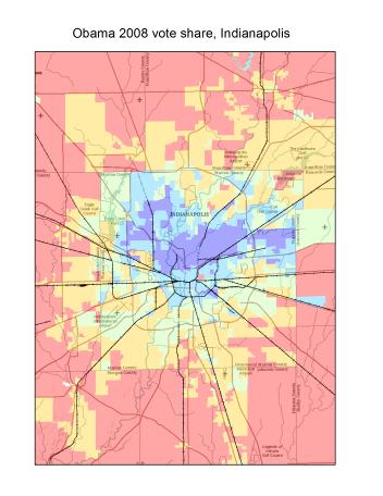
Another interesting feature of the map is the spatial distribution of partisanship in and around the relatively large agglomerations. Democrats are highly clustered in city centers, like Indianapolis in the map to the left, but as one moves from the center into the older suburbs, one sees a linear decline in Democratic voting that continues into the newer suburbs and exurbs, all the way to the rural periphery. Of course these electoral maps mimic metropolitan maps of well-known correlates of voting behavior, including population density, income, race, home ownership, year of home construction, etc. |
|
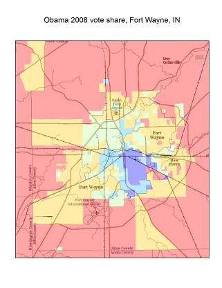
Note that this pattern is not limited to large cities like Chicago, Detroit, and Indianapolis. It can also be found in smaller cities like Fort Wayne, Indiana (depicted in the map to the right) or even towns like Anderson, Muncie, or Kokomo. |
|
Note: This legend applies to all maps on the page |