During summer I usually spend a lot of hours locked up at an altitude of 30000+ feet, and this year I took ggplot2: Elegant Graphics for Data Analysis as reading material. ggplot2 is a data visualization package for the R statistical analysis platform. It is loosely based on "The Grammar of Graphics" from Leland Wilkinson, thus taking a different approach from traditional graphics packages by very explicitly mapping the data to aesthetic attributes (eg. colors) and geometric objects (eg. points).
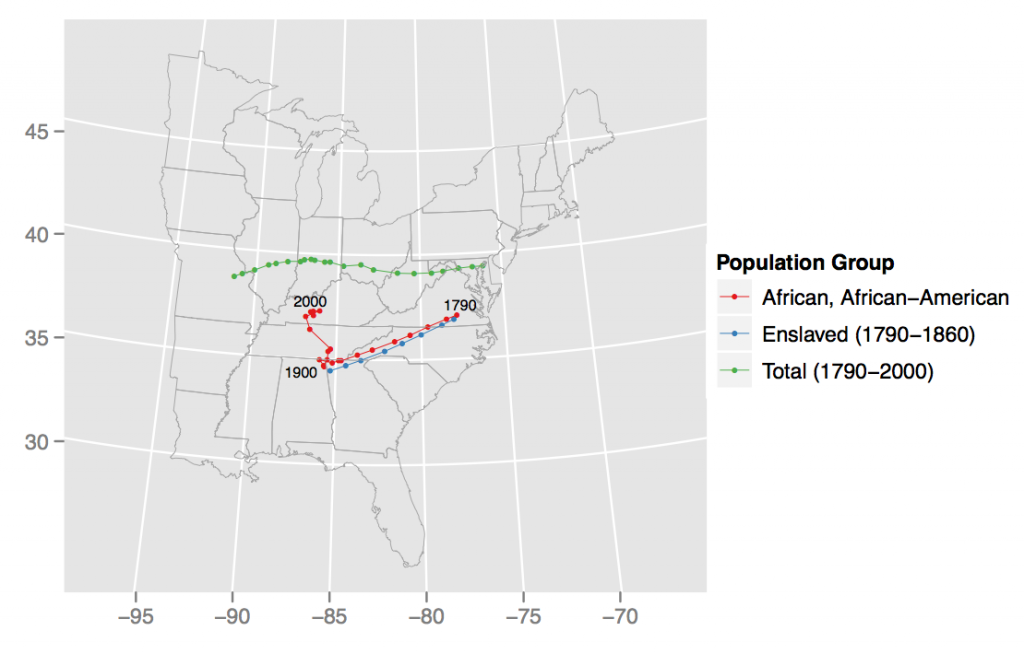
Here is my first attempt to use the ggplot2 package. I was interested in the change of the mean population center of the US between 1790 and 2000, similar to the map that is put out by the Census Bureau, but specifically looking at the initially African, then African-American population.
I downloaded census data and county outlines from the National Historical Geographic Information System website, merged the data for each census year on the county level, and calculated the weighted mean for each census year. (Data are here.)
With only a few lines I was able to generate the following graphic. It shows the trajectory of the African American population moving southwest, thus diverging from the pretty straight westward movement of the total population. After 1900 the the northern migration begins, with a major jump towards the North in the decades of 1940 and 1950 and also between 1950 and 1960.
The code for this is quite simple. The graphics object is built up in several steps, first adding the data as points, then as paths, then setting the basemap and finally adding the labels.
