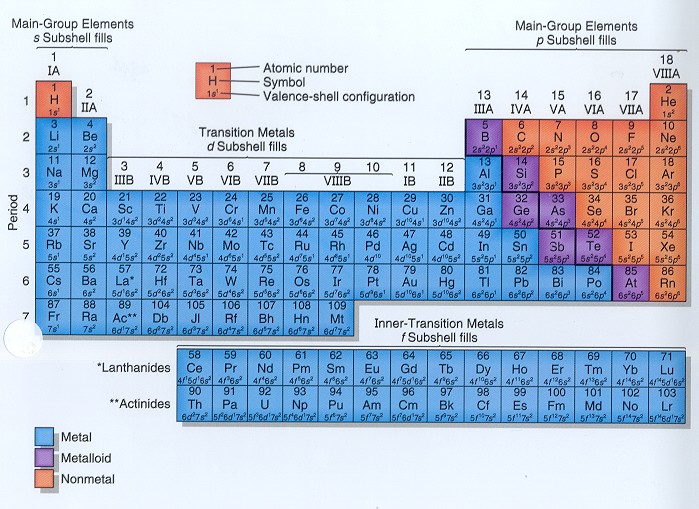
The Periodic Table of Elements, http://library.tedankara.k12.tr/chemistry/
The Periodic Table of Elements, http://library.tedankara.k12.tr/chemistry/
The use of visualization is pervasive in textbooks: diagrams explaining
complex physical systems, graphs showing the relationships between
theoretical and measured properties,
etc.
In each case, the author of the visualization tries to convey a point
by emphasizing some aspects of the data while toning down other
aspects.
The result can vary widely, from informative to misleading.
For this assignment, go to the library (or your own bookshelf) and pick
out an example of a good and a bad visualization
from academic textbooks. You are encouraged to use the readings for the
course to help guide your analysis, but do not use them to find the
example; go to original sources.
Here are a few suggested domains (you are welcome to choose
something else -- these are just suggestions):
Once you have selected a good and a bad example, make a web page.
Include in your web page both pictures, and two
paragraphs for each picture.
The first paragraph should tell the story
behind the picture: what does this picture show?
The second paragraph should critique the visualization,
explaining why you think it is good or bad. Be specific,
and include criteria such as accessibility, clarity, accuracy, or any
other criterion
about the design of the visualization that you feel is important. Make
your web page publically accessible,
and be prepared to show your web page and
discuss your findings in class on January 20.